
Type Family 123
The family comprises 4 weights from light to ultra with an italic version. Lighter weights were developed keeping the width of the character consistent and adding length to the slab serif.
The basic design shapes for the font come from the strong personality of the ultra heavy characters drawn by Francesco Canovaro. The basic shape has a modernist logic with slight calligraphic variations like the tail of the j, of the l and the hectic k. Uppercase letters are drawn with a slab serif look, as the font is thought to work better in upper/ lowercase combinations.
The family comprises 4 weights from light to ultra with an italic version. Lighter weights were developed keeping the width of the character consistent and adding length to the slab serif.
Show more
cazzo
Type Family 123
Hope 2022
Kair coin
Yogurt greco
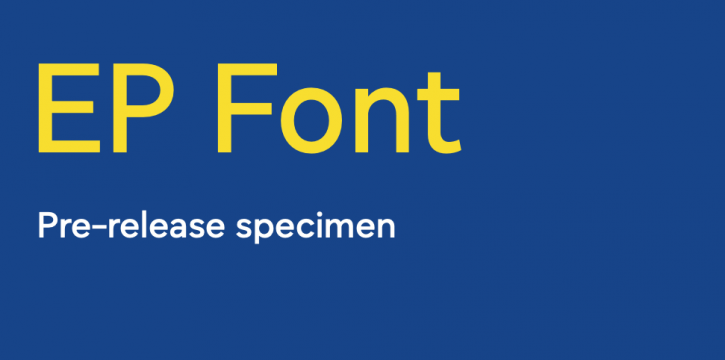
EuroSans: A Dynamic Typeface for the European Parliament


